Aggregated Listing Pivot Table Use
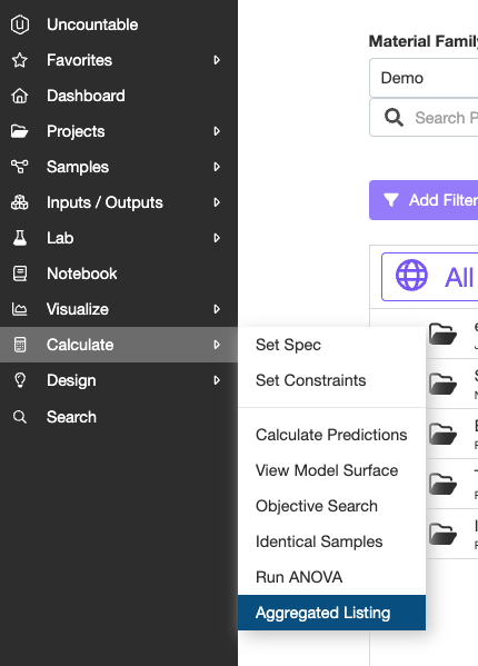
The best way to create a pivot table-like data structure in the platform is through the Aggregated Listing tool. To locate this tool, navigate to the ‘Calculate’ tab on the toolbar, and click on ‘Aggregated Listing’. Here, you can aggregate data across all listings in the platform. Examples of listings are experiments, lab requests, ingredients, outputs, calculations, tasks, ie. any entity in the platform.
The first step to using this feature is to select your data set, or the type of entity you wish to pull information from. Once you have selected your data set, you can begin setting up your listing. The Aggregated Listing page resembles a typical listing page in the platform; however, it has additional options for setting the columns. To the right of the search bar, you will see the ‘List’ icon. Click this icon, and select ‘Set Columns’.

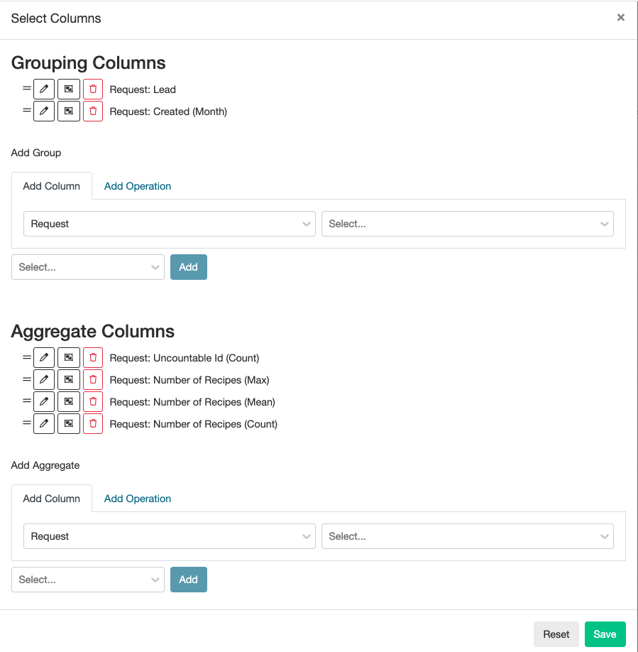
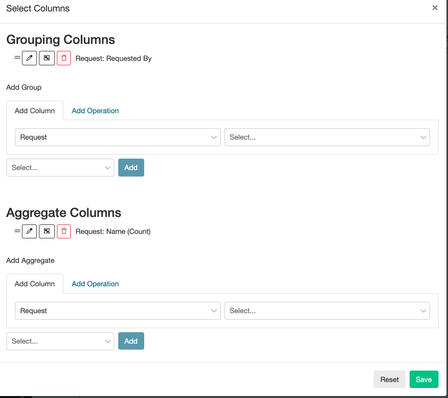
Here, you will find two sections: Grouping Columns and Aggregate Columns. The Grouping Columns dictate how the data is organized in your listing. The Aggregate Columns will show which data you want to identify. You can edit the order of the columns by dragging the two lines (to the left of the column name) up and down before hitting the green save button to create your aggregated listing.
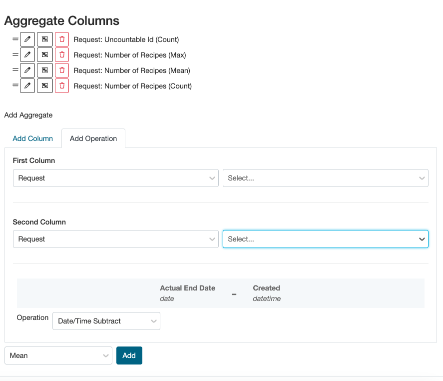
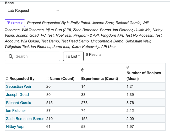
For example, you may want to look at information regarding lab requests. First, select ‘Lab Request’ for your data set. In this case, we want to see the Uncountable ID Count (ie. number of experiments), the max number of recipes associated with that request, the mean number of recipes associated with that request, and the count of the number of recipes associated with that request; we want to organize these data by the ‘Lead’ and by Date Created. This table now shows us that for the lab requests created by Noel in the month of June, there were 16 requests created, the maximum number of recipes per request was 8, the average number of recipes per request was 4.43, and the number of recipes, etc.

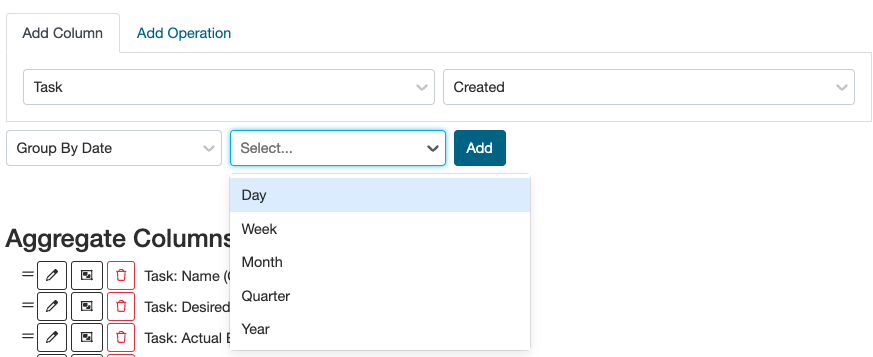
Not that when grouping a column by date, you can aggregate by day, week, month, quarter, and year.
You can also perform operations on columns. This tool is found in a tab to the right of the ‘add column’ tab within the Set Columns page. This is particularly useful when calculating durations of time. For example, you may create an operation to show you the average time difference between time of when the request was created and when the request was finished. Here, I selected Actual End Date in the first column and Created in the Second Column. Time interval calculations help to identify how efficiently tasks are getting completed.
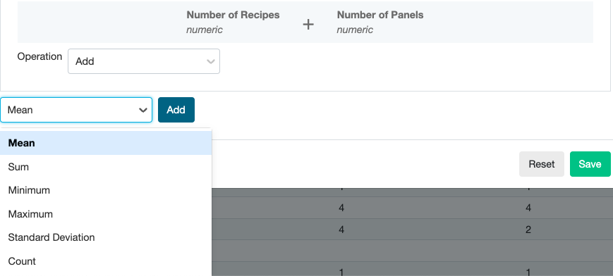
Unlike with date fields (which only have the Date/Time Subtract operation), when performing an operation on two numeric fields (such as number of experiments), you can add, subtract, multiply and divide those fields. You can also specify whether you want to look at that operation’s mean, standard deviation, min, max, etc.

You can also apply filters to any of the columns you configure based on fields in the definition of the entity or other information stored with that entity. The filter tool is found in purple above the search bar (same filter functionality as any other listing in the platform). Finally, you can export your table by clicking the ‘List’ icon and ‘export’. This pivot-table-like tool is helpful for investigating how a company’s resources are being used, which projects are being worked on, how many requests are being created by which people, etc.
Aggregated Listing Chart Use
To configure a plot using the aggregated listing tool, you must be in a notebook. Once you’re in a notebook, select the + symbol on any line and add a Chart.

Then click ‘Edit Chart Configuration’. From here, the aggregated listing setup is very similar. Select your base (lab request, project, tasks, etc.), and then ‘Set Columns’ to organize grouping and aggregation columns. For example, you may want to see how many requests were created by individuals. Set up the columns as such:
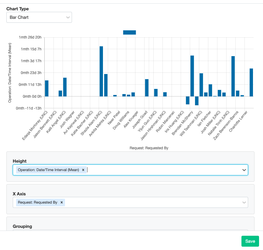
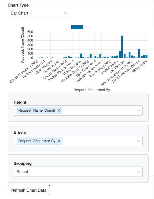
Then, choose a graph type and which data you want to display on the axes of the graphs. The aggregated listing can graph bar charts, line charts, pie charts and radar charts. In this case, I want to display a bar chart with individuals on the x axis and number of requests (achieved by aggregating the Request Name (Count)) on the y axis.
If you would rather display your data in a pie chart, select the pie chart and fill out the height and x-axis with the same variables. Here, you may want to add a filter to the ‘Requested By’ field to narrow down the users included in this pie chart. The same method is used for line charts.

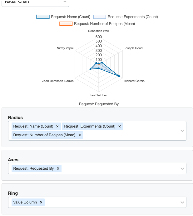
For a radar plot, you must have numeric fields for the radii and at least 3 axes/data points (in this case, the people in the ‘Requested By’ field). If some individuals in the ‘Requested By’ field are irrelevant to what you are looking for, you can add a filter to any of the columns you’re aggregating to narrow down your radar plots axes.
Finally, click save and your chart will appear as a live chart within the notebook. If you want to edit the chart, you can always select the settings cog and then ‘Edit Chart Configuration’.
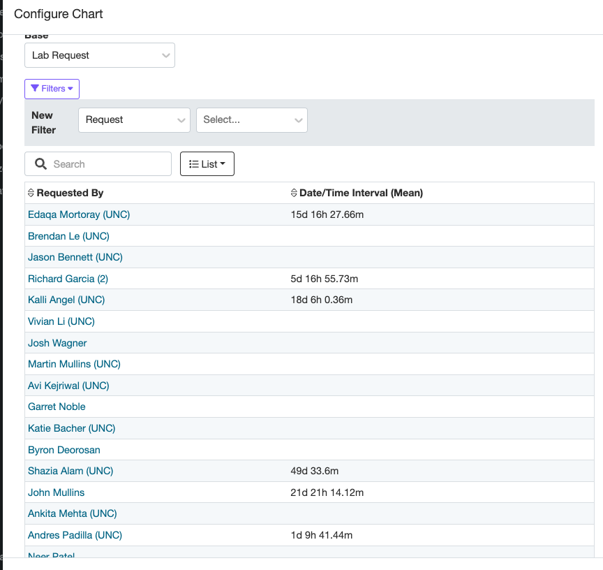
Additionally, you can still utilize the operation column function in a chart. For example, you want to see the average difference in time from request creation date to the end date per individual. As discussed above in the pivot table section, create an operation Aggregation Column subtracting dates. Then, select your bar chart’s height as the ‘Date/Time Interval’ operation, and the ‘Requested By’ field as the x-axis. Now, you have a chart displaying each individual’s request time efficiency.