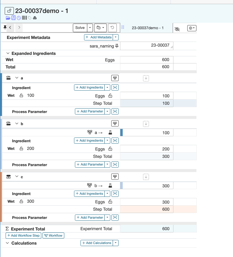
- Here is a sample recipe that will be used for this example, notice how the ingredient “Eggs” is present in each step of the workflow (a, b, and c) in different quantities.
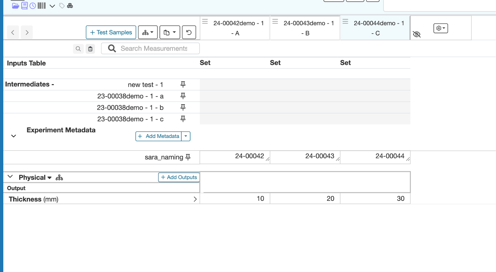
- To create test samples for this experiment, go to the “Measurements” page, and click on the “+Create Test Samples” button
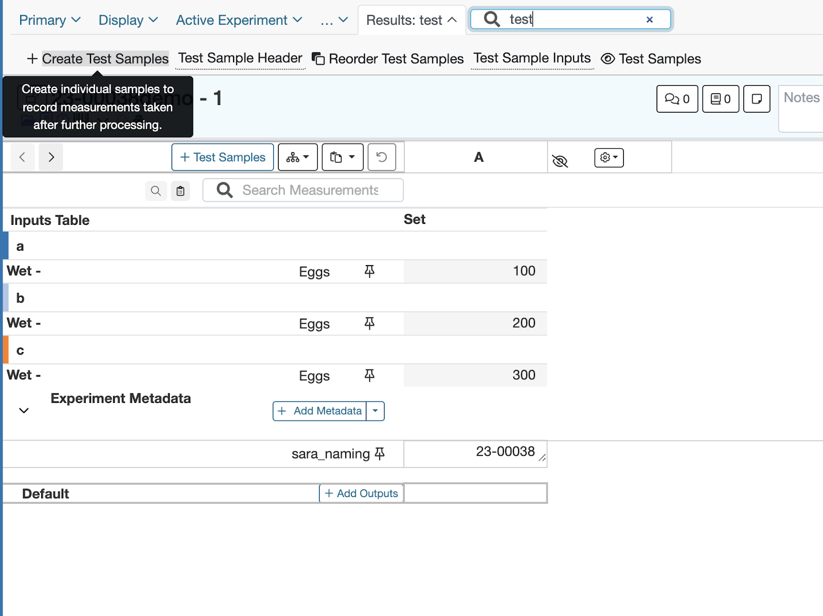
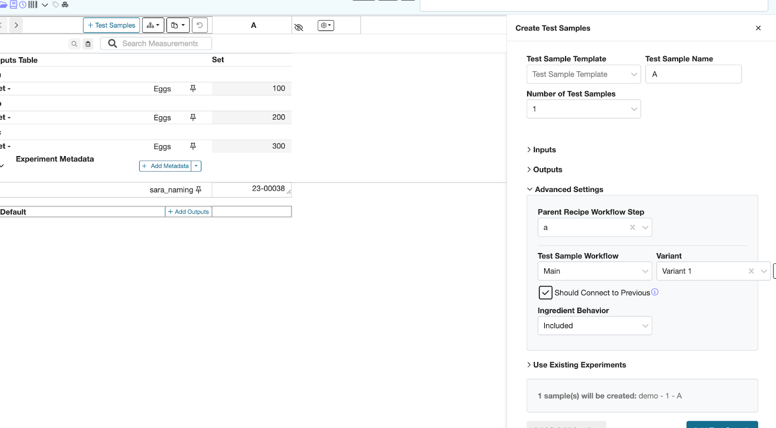
- Add the inputs and outputs you would like included in the test sample, and under “Advanced Settings” select a workflow step that this test sample should be associated with
- After doing this for each workflow step, add different measurement values to each test sample.
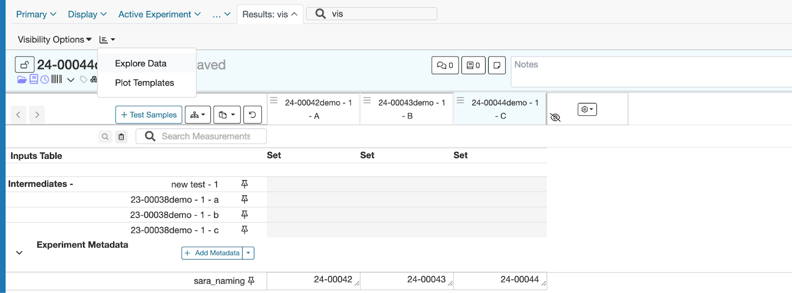
5. To start visualizing this data, search for “visualization” in the tool bar, and select the “Explore Data” option from the dropdown
6. To start, select “Experiment Names” for the X axis, and the input you would like to visualize (in this case “Input: Eggs”) for the Y axis. For the Y axis settings click the “Include Preceding Steps” option and select the step you would like to visualize the ingredient quantity for.
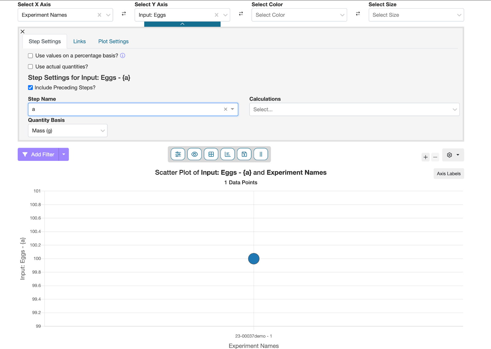
7. Egg quantity for step A
b. Egg quantity for step B
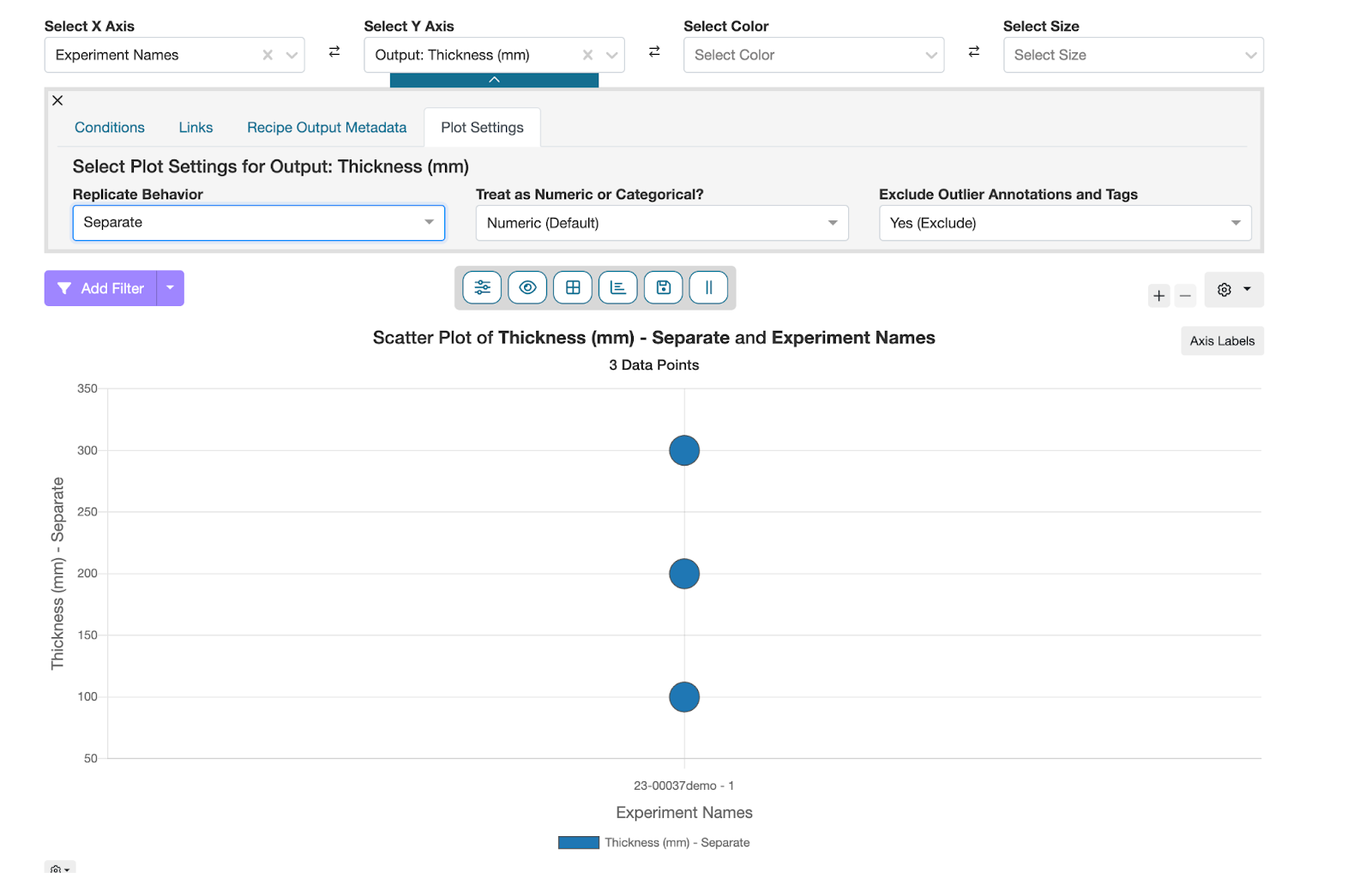
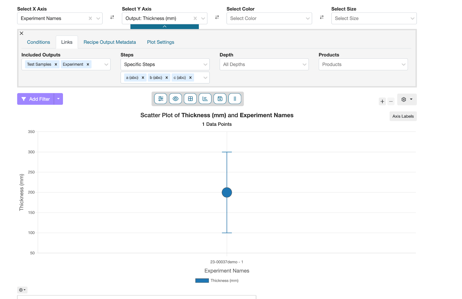
8. To view information about test sample outputs, select the output you would like to visualize for the y axis. In this case, that will be “Output: Thickness (mm)”. In the Y axis settings in the “Plot Settings” tab set replicate behavior to “Seperate”. This will split test sample results into separate points on the graph