Box and Violin charts are both designed to be used when visualizing differences in distributions between categorical variables. Box charts include more statistical-oriented features of the plot, while Violin charts are purely visual representations. It is critical to understand and recognize the need for a categorical variable for the x-axis, otherwise the graph will not likely be useful.
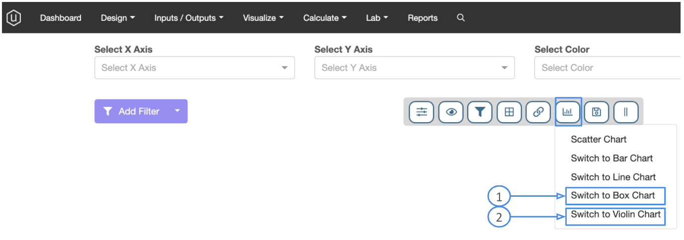
To access either of these charting options, while in the Explore Data page, click on the button bar to change chart type and then select your desired option.
Box Charts:
Once you’ve selected Box Charts, you will notice that the axes options on the top of the page will adjust to have only 3 options.
In the image below – object 1 is where your categorical variable will go. For instance, you could use an experiment tag, which polymer is used, or maybe a categorical processing variable.
Object 2 can be used for the critical value of interest – an output or another continuous numerical value. Object 3 below can be used if you need to differentiate along another variable with the categorical groupings on the X axis.

In the example below, Experiment Tags are used for the X axis and the output of Tensile Strength is used on the Y axes.

Each X axis grouping will have it’s own “box” distribution created. Boxes have the following features to them that describe different aspects of the distribution being displayed. Those features are explained in the figure below.

Violin Charts
If you are interested in a similar visualization data but without the specific features of the distributions, you can select a Violin Chart. As you can see from the figure below, the distributions are displayed more as point clouds. The more points at a Y-value, the wider the cloud will be. Violin charts are also helpful to inform the number of data points that are included in each distribution.

In both plotting options, if you wish to further split out the populations, you can use the “Select Color” axis to pick another categorical variable (numerical values can be selected, but will most likely not display in a manner that is helpful).
One thing worth mentioning: for Violin charts, the outer shape of each point cloud is randomly created. Within each category (as experiment tags in the example above), points are scattered in the clouds to prevent overlap. The wider the cloud, the more points in that region. But the horizontal position of each point within a cloud is completely random.
In summary, both Box and Violin charts are great options for visualizing differences in distributions between categorical variables. Box charts show four main features about a categorical variable: center, spread, summary and outliers. It treats data points outside 1.5* inter-quartile range above or below and whiskers as outliers, while the Violin plot shows the data’s entire distribution without classifying some as outliers.