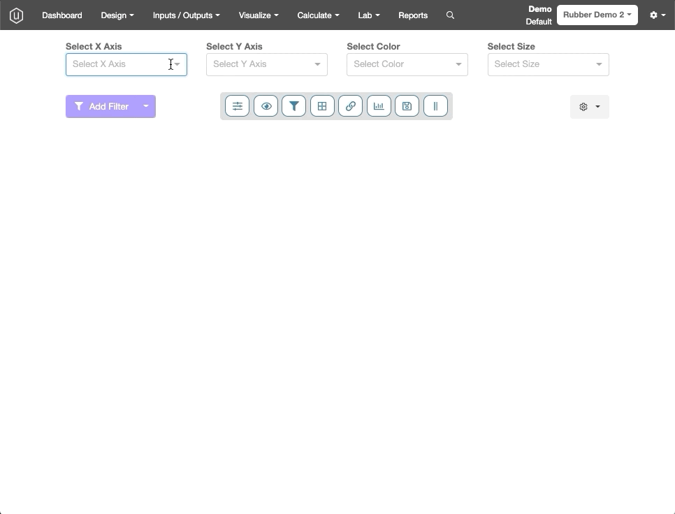
Once your data is stored and structured in Uncountable, you can easily explore the relationships between all of the variables in your data through the powerful plotting options available in Uncountable. First, navigate to the Explore Data page from the Visualize tab in the navigation bar.

Creating a Plot
To create a plot, simply select values in the the drop-down menus at the top of the screen for x-axis, y-axis, color, and size, and the chart will populate accordingly.
Entities available for plotting
The most commonly referenced entities for plotting are ingredients, process parameters, and measurements. There are a variety of other options available as well, which are described in more detail below:
- Ingredient: Plots the amount of the ingredient used in a given formulation. If you are working in parts, you will have the option to plot in either parts or percentages.
- Process Parameter: Plots the value of a process parameter (for example, mixing speed (rpms)). If the parameter is a categorical variable, plotting it as a color is likely the best option.
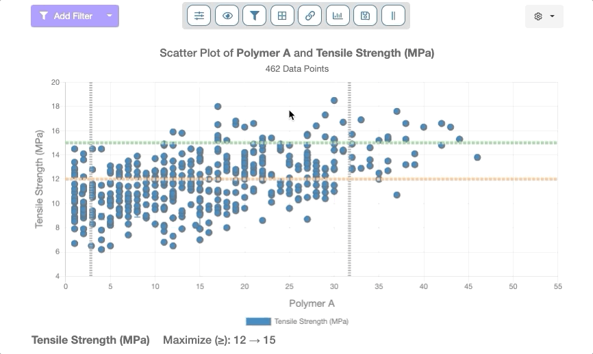
- Measurement: Plots the value of the measurement. If the measurement has a set of conditions associated with it, you will have the option to specify the exact condition set that you wish to plot. For example, you may want to differentiate between a tensile test run at 23°C and 100°C. If you don’t specify, in this case, the results will be averaged across the condition set and the variance reflected by an error bar.
- Outputs with default condition parameters will have those conditions applied automatically when used in visualizations or filtering. If you receive an “Output with specified conditions has no data – please look at adjusting conditions” error message when attempting to plot, you need to adjust plot settings. Refer to Plotting Outputs with Default Condition Parameters for more details.
- Experiment Name: Groups by experiment name. This is often used as the x-axis option for a bar chart to compare results.
- Output Conditions: Allows the selection of a specific output condition or output metadata to be plotted such as aging time or test temperature. This option may help you to understand trends in particular outputs when run under different test conditions.
- Custom Value: Includes a variety of other plot options that may be useful in specific circumstances such as plotting standard deviation, most common ingredients, and individual replicate values. Please contact your Account Manager if you are interested in learning more about these options.
Filtering
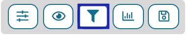
Add Filter: The standard filtering options are available here if you’d like to constrain your plot in various ways such as only looking at experiments that use a specific ingredient or pass a given measurement threshold.
Lasso Filtering: The lasso filter capability allows you to circle the set of data on the screen that you want to include/exclude by clicking and dragging your mouse.
Set Custom Chart Settings
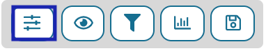
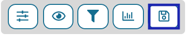
Above the visualization, there are a variety of options and features that users can use to modify their visualization easily. Users can Set Custom Chart Settings, Show Points with Zero Values, Show Filtered Points, Switch Chart Mode, or Save/Load Visualization.
Clicking on the Set Custom Chart Settings button will call up a modal dialog box with several tabs which allows users to modify the various display functions for their visualization.
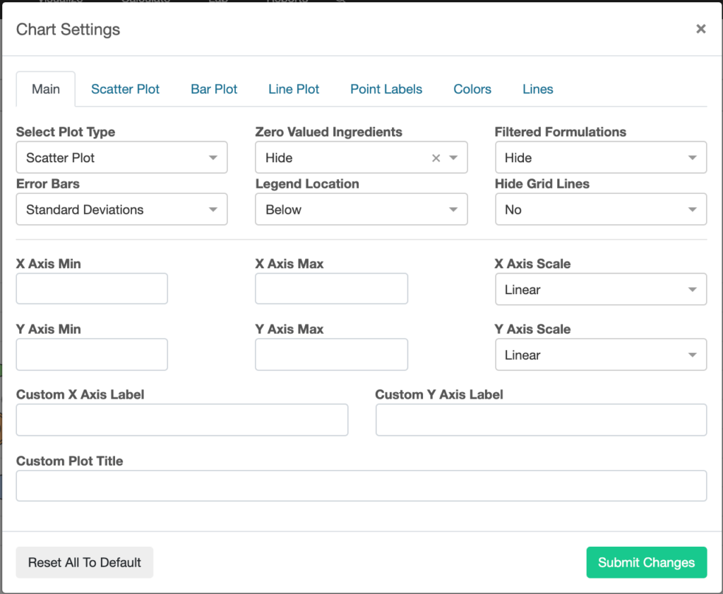
There are a series of configuration options under the Main tab:
- Users can select between various kinds of plots: Scatter Plot (default), Line Plot, Bar Plot, Box Plot, or Violin Plot.
- Users can elect to display or hide zero value.
- Users can show, hide, or filter their formulations.
- Users can establish a consistent error bar: Standard Deviations (default), Standard Errors, 95% Confidence Interval, Full Range, or Hide Error Bars.
- Users can relocate the legend either below, above, left, right, or hide it entirely from view.
Users can use the text boxes provided to set minimum and maximum x and y-axis values, scale both axes along linear or logarithmic regression lines, and rename the visualization, x-axis, and/or y-axis.
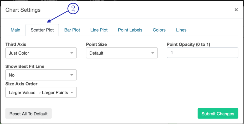
The second tab, Scatter Plots (2), allows users to modify the display functions for scatter plots. Users can:
- Set the third axis to display color and size or color alone.
- Change the size of each point.
- Modify the opacity of each point using decimals up to 1.00.
- Allow a best fit line to be placed over their displayed data. Available options are linear, logarithmic, quadratic, exponential, power, or none.
- Choose whether larger values should be represented by larger or smaller points.
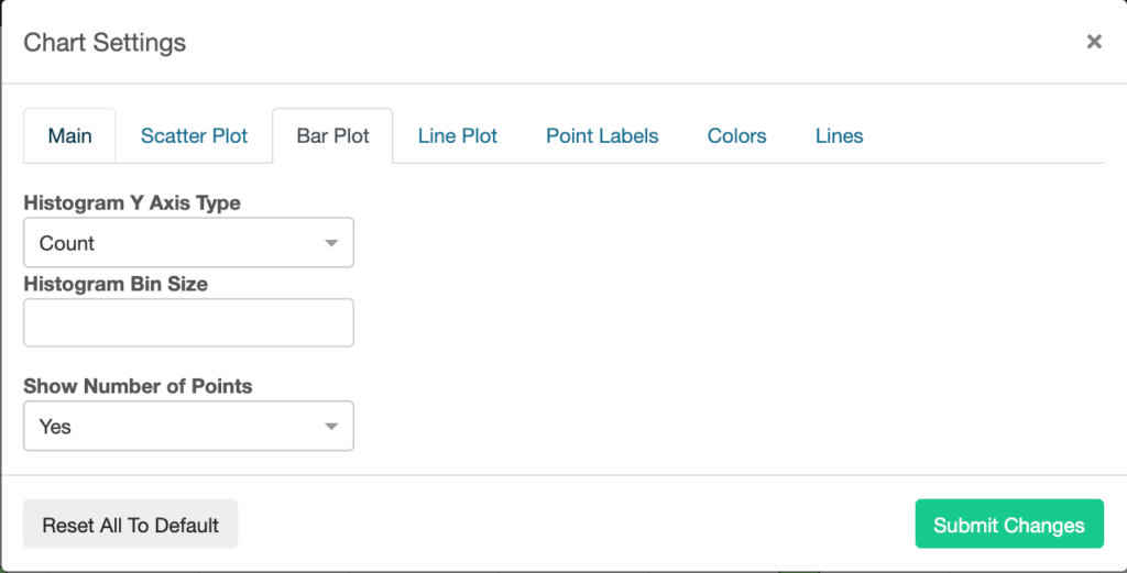
The Bar Plot allows users to adjust the Histogram Bin Size and Y-Axis Type (Count or Percentage) of their Histogram.
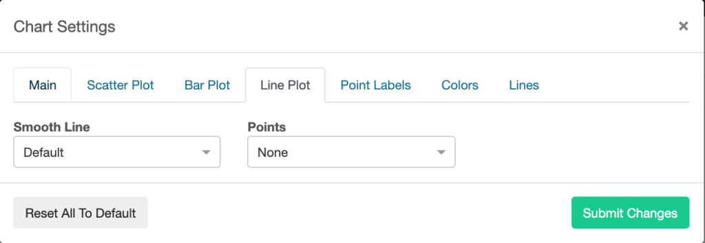
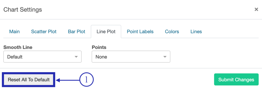
The Line Plot tab allows users to adjust the Smooth Line (Default or Disable) and Points (None, Small, or Large) of their plot.
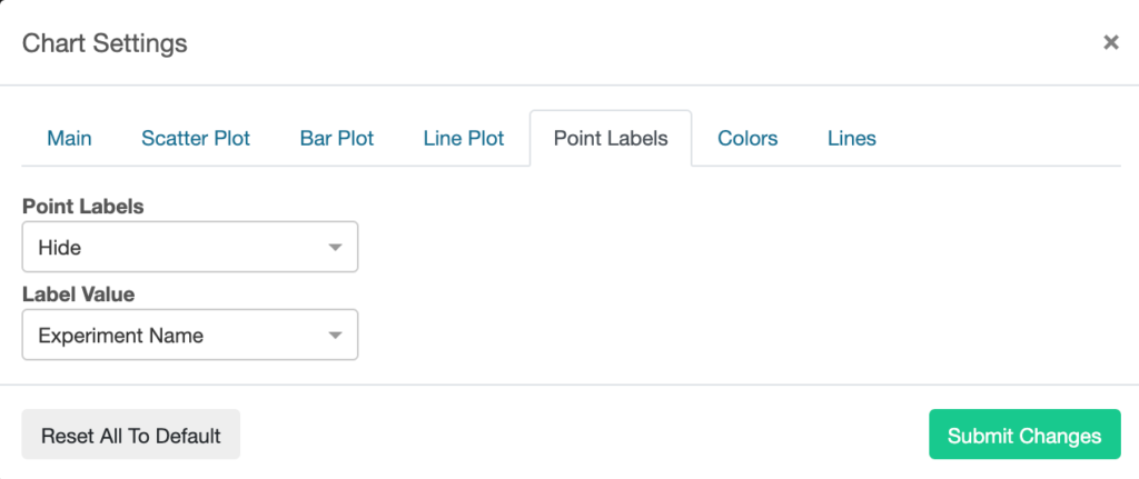
The Point Labels tab allows users to show/hide labels at each point of their plot. They can also adjust the contents of these labels (display experiment name, x value and/or y value).
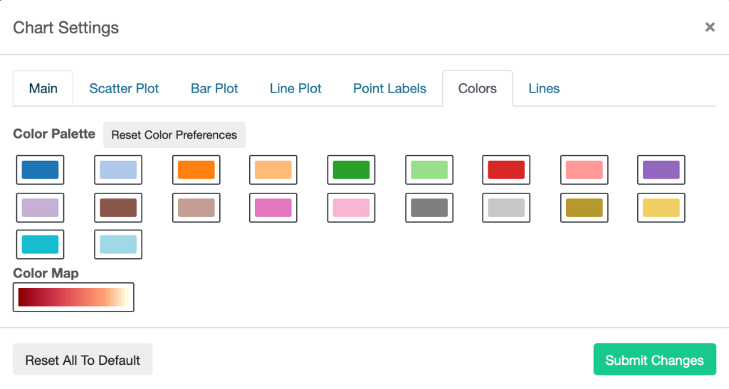
The Colors tab allows users to set which color scheme they would like to be featured in their visualization. There are twenty color schemes available. Below these color options, there is a Color Map which displays the full gradient range for a user’s selected color(s).
Finally, the Lines tab allows users to adjust various settings related to the visualization’s axes.
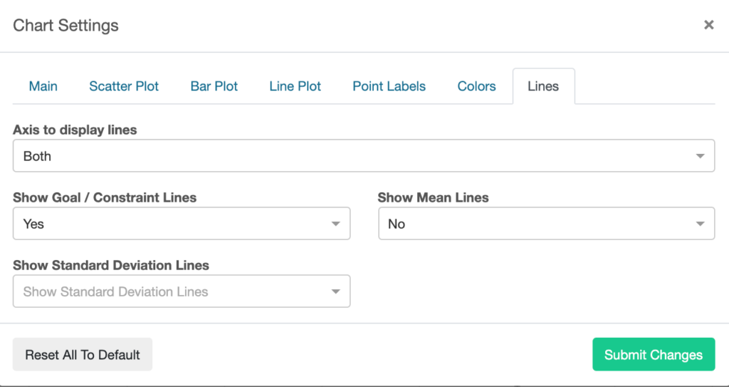
- Display either both axes, neither axis, the x-axis, or the y-axis.
- Display or hide goal/constraint lines.
- Display or hide mean lines.
- Display or hide standard deviation lines.
- Display or hide 3 standard deviation lines.
At the bottom of all of these tabs is a Reset All to Default button (1) which, when pressed, will reset all of the fields within a given tab to their default settings.
Show Point with Zero Values: Clicking on the Show Points with Zero Value button will toggle between displaying and hiding data points that have a value of zero.
Show Filtered Points: Clicking on the Show Filtered Points button will toggle between displaying and hiding data points that have been filtered out.
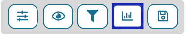
Show Chart Mode: Clicking on the Switch Chart Mode button allows users to transpose their plot into another format easily. Available options include: Scatter Chart (default), Bar Chart, Line, Box Chart, or Violin Chart.
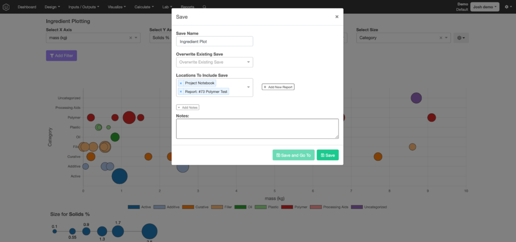
Save/Load Visualization: Clicking on this icon enables the saving of charts to a report, notebook, or template and sharing plots with other Uncountable users from your organization. Please refer to the Creating Reports article for a step-by-step description of how to add plots to a report or template.
If a user clicks the Save Visualization button, they will be brought to a new modal dialog box that allows them to name their visualization, overwrite a previously saved visualization, save to a specific location, add notes, and/or generate a new lab report with their visualization.
The Save and Go To button will only be available if the user has selected a single location to save to. If clicked, the visualization will be saved and the user will be brought to its corresponding save location.
If the user clicks on the Load Visualization button, they will be prompted by a new modal dialog box. Here, the user will select a visualization to load from a dropdown list.