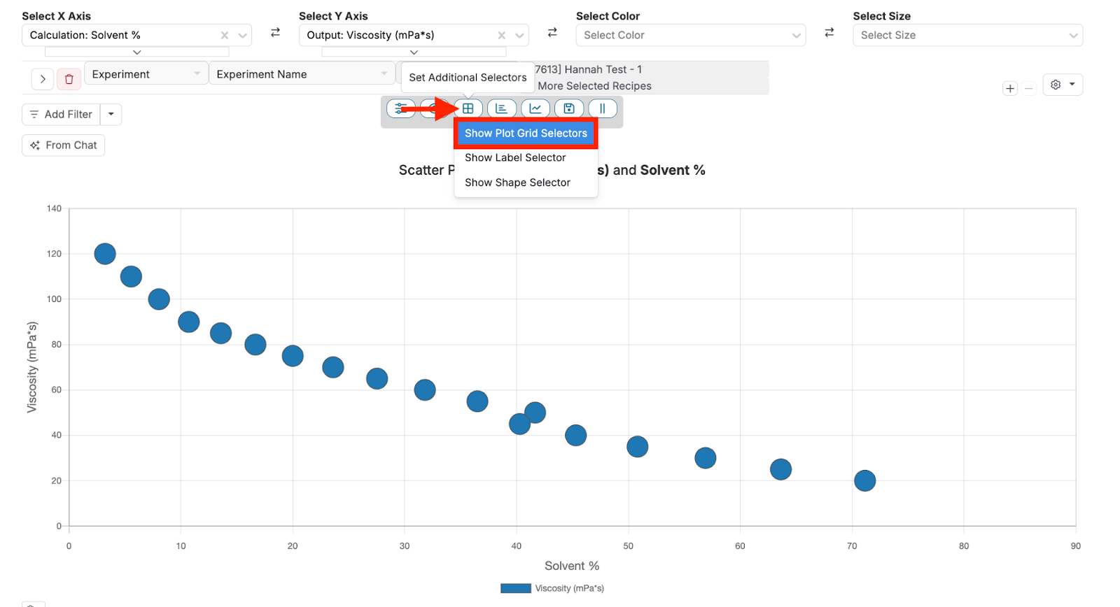
Uncountable’s Explore Data page offers tools for visualizing and analyzing your data. Among these tools are three advanced selector options accessible via the “Set Additional Selectors” button. These options include Plot Grid Selectors, Label Selector, and Shape Selector. This guide will walk you through how to use these selectors effectively.
Plot Grid Selectors
The Plot Grid Selectors option allows users to divide their graph into rows and/or columns based on two or more additional parameters. This feature is useful when comparing how specific condition parameters influence experimental outcomes across different categories or distinct numeric values. For example, if you want to compare the impact of temperature, solvent concentration, or test duration on the properties of a material, you can split the graph accordingly to gain deeper insights.
Plot Grids Selector Use Case
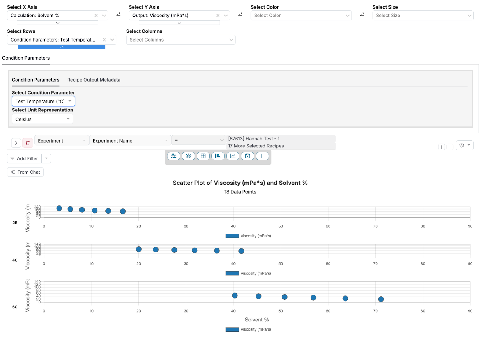
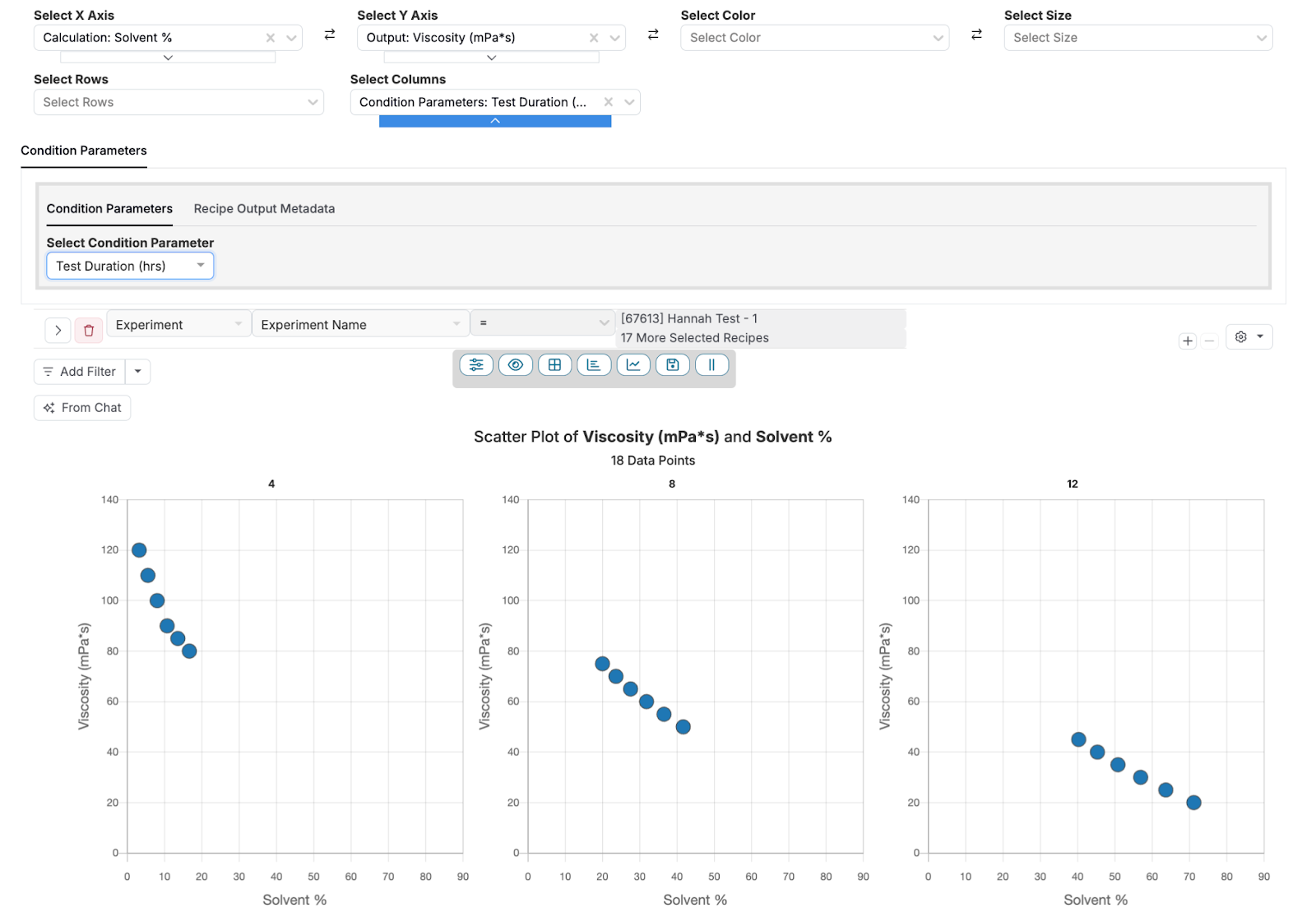
Plot Grids Selectors could be used to examine how the concentration of solvent, test temperature, and test time affect the viscosity of a resin mixture. The viscosity was tested under three different temperature conditions (0°C, 40°C, and 50°C) and at test lengths (4, 8, and 12 hours), with varying solvent concentrations.
Rows Separated by Test Temperature (0°C, 40°C, and 50°C)
The first configuration plots Viscosity (mPa*s) against % Solvent with rows to separate by the test temperature condition parameter. This creates three separate graphs, one for 0°C, another for 40°C, and another for 50°C. This setup allows us to see how viscosity varies across different solvent concentrations under each temperature condition.

Columns Separated by Test Time (4, 6, and 8 hours)
The second configuration has the same X and Y axes, but the data is now split into columns based on the test time condition parameter. This creates three separate graphs, one for 4 hours, another for 8 hours, and another for 12 hours. This allows for a comparison of how the viscosity of the epoxy mixture changes over time.

Using a Plot Grids Selector
To set up a Plot Grid Selector, first ensure that your experiments have measurements with one or more condition parameters. From the Explore Data page, follow these steps:
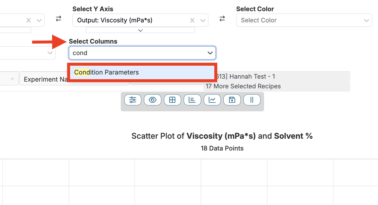
- Click the Set Additional Selectors button and select “Show Plot Grid Selectors”.
- To add rows, select “Condition Parameters” from the Select Rows dropdown menu.
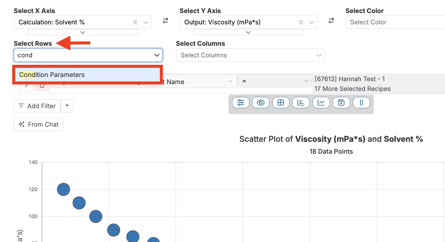
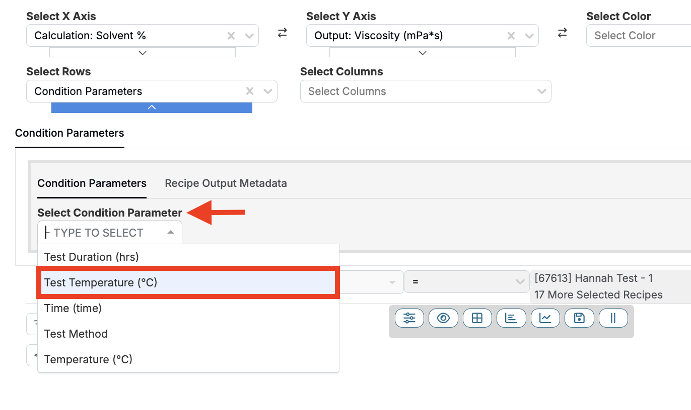
- Select the condition parameter by which you want to split your graphs (i.e. Test Temperature) from the Select Condition Parameter dropdown menu.
- This will result in distinct graphs, separated into rows by condition parameter values.
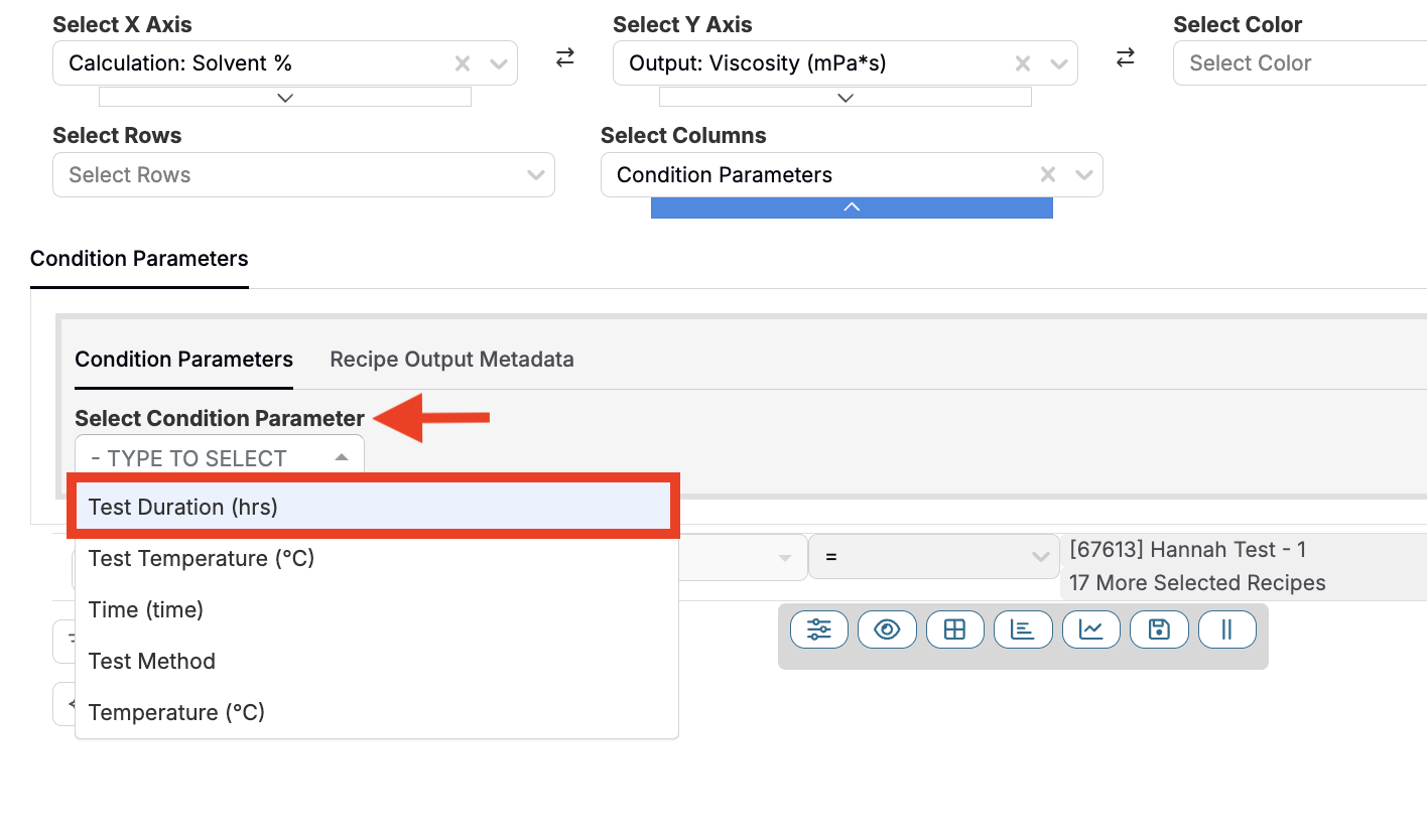
- To add columns, select “Condition Parameters” from the Select Columns dropdown menu.
- Select the condition parameter by which you want to split your graphs (i.e. Test Duration) from the Select Condition Parameter dropdown menu.
- This will result in distinct graphs, separated into columns by condition parameter values.
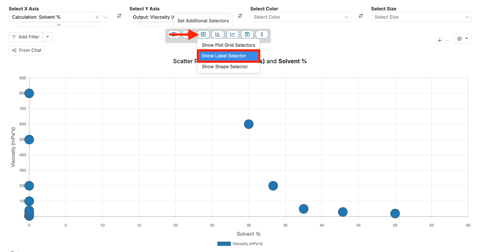
Label Selector
The Label Selector option enhances your data visualization by adding labels to your data points. These labels can convey additional information about the specific conditions associated with each data point, making it easier to identify patterns, correlations, or anomalies directly within the graph.
Label Selector Use Case
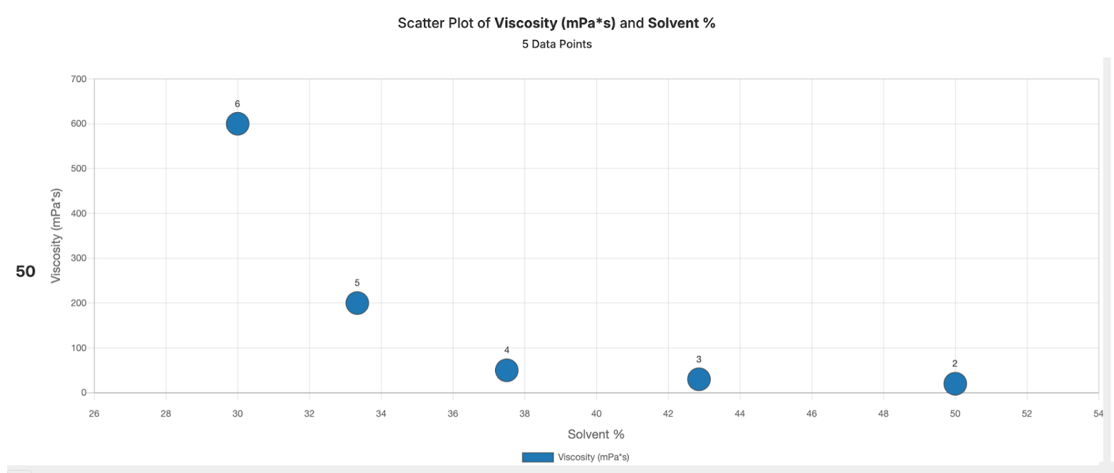
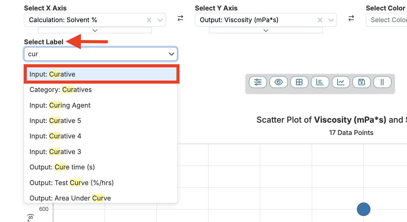
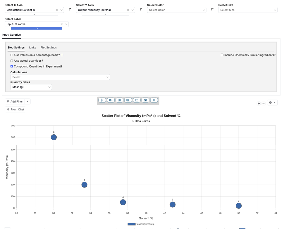
Consider a scenario in which you wish to examine how various curatives impact the viscosity of a resin mixture at different solvent concentrations. The mixture contains a resin, hardener, solvent, along with five different curatives (Curative 1, Curative 2, Curative 3, Curative 4, and Curative 5) used in separate tests.
First, you can create a plot of Viscosity (mPa·s) vs Solvent %, showing the relationship between solvent concentration and viscosity. However, this plot alone doesn’t reveal which curative was used for each data point. By using the Label Selector to apply the “Curatives” label to each data point, you can now see which curative corresponds to each viscosity measurement.
Using the Label Selector
To set up a Label Selector from the Explore Data page, follow these steps:
- Click the Set Additional Selectors button and select “Show Label Selector”.
- Choose a field (i.e. Curative) from the Select Label dropdown menu.
- Labels are added directly onto the graph, above the individual data points.
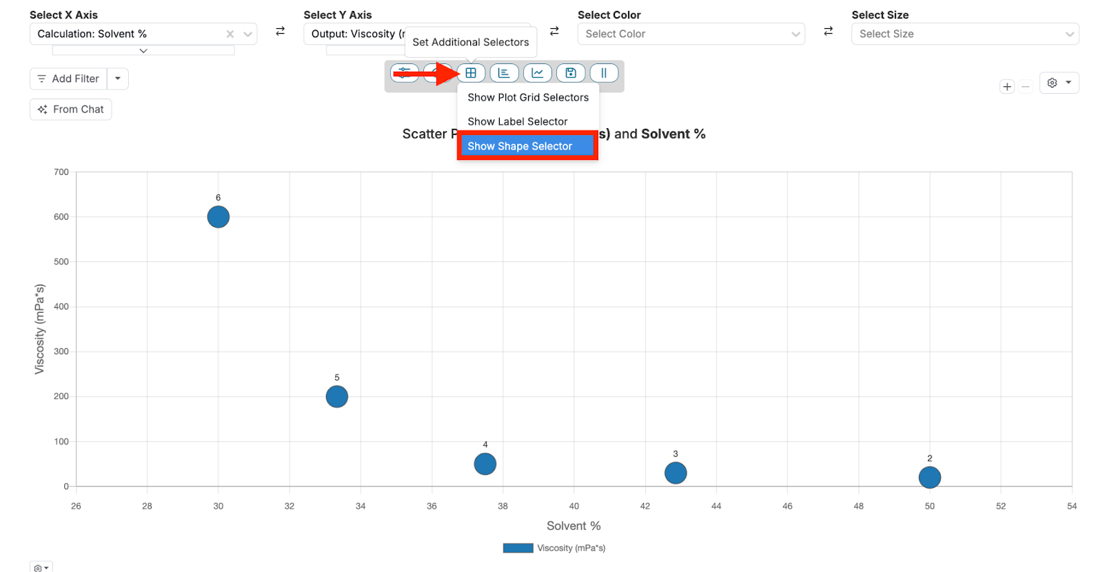
Shape Selector
The Shape Selector allows you to represent different categories of data with distinct shapes on a graph, making it easier to differentiate between them. This feature is especially useful when you’re dealing with categorical parameters and need to quickly identify which data points belong to which category.
Shape Selector Use Case
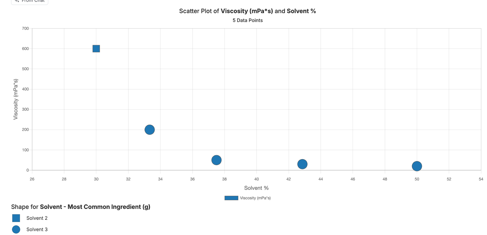
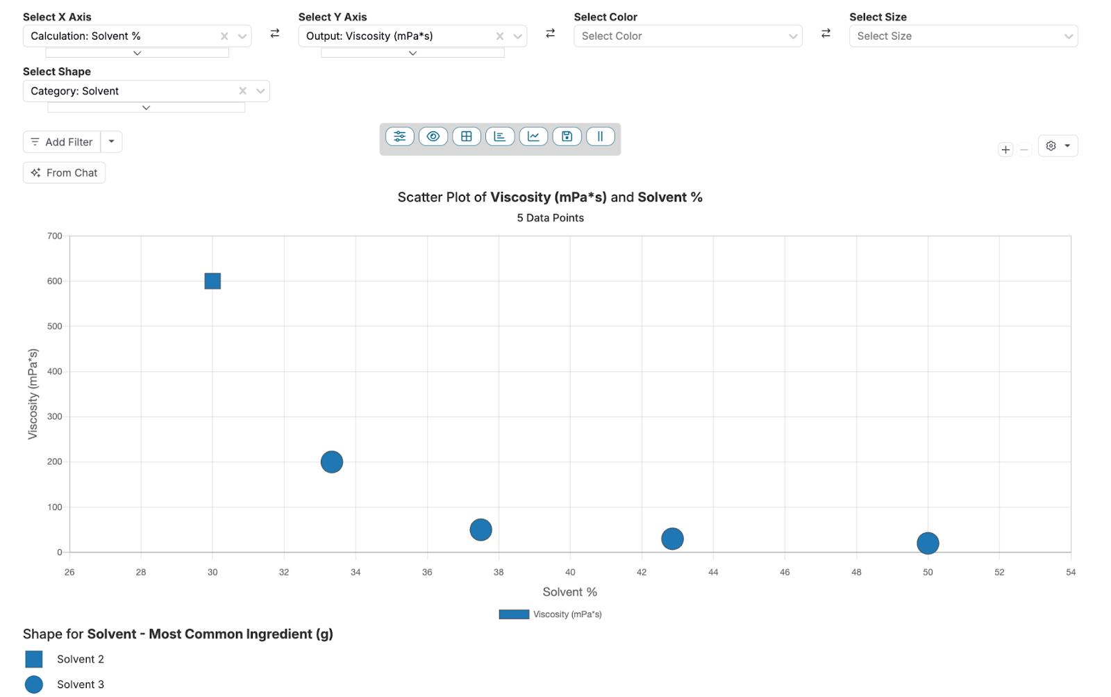
Consider a scenario in which you wish to examine how different solvents affect the viscosity of a coating formulation. The formulation includes a resin, hardener, and two different solvents (Solvent 2 and Solvent 3) used in separate tests.
You can start by creating a scatter plot of Viscosity (mPa·s) vs Solvent % to visualize the relationship between solvent concentration and viscosity. However, this plot alone doesn’t differentiate which solvent was used for each data point. By using the Shape Selector to assign unique shapes—such as squares for Solvent 2 and circles for Solvent 3—you can now easily identify which solvent corresponds to each viscosity measurement.
Using the Shape Selector
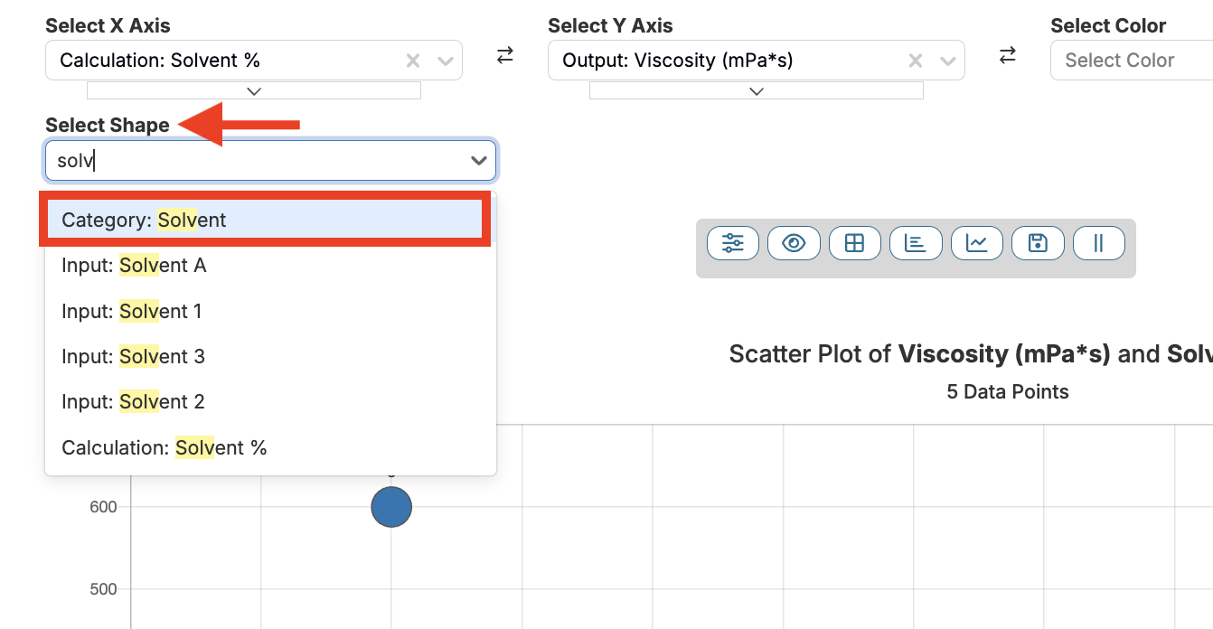
To set up a Shape Selector from the Explore Data page, follow these steps:
- Click the Set Additional Selectors button and select “Show Shape Selector”.
- Choose a field (i.e. Category: Solvent) from the Select Shape dropdown menu.
- Data points are now displayed as distinct shapes on the graph, with a key at the bottom to indicate which shape corresponds with which category.
These advanced selector options on the Uncountable platform’s Explore Data page empower users to create more detailed and insightful visualizations. By applying these tools, you can enhance your data analysis and uncover trends or correlations that might otherwise go unnoticed.