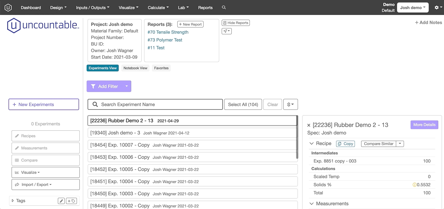
Uncountable’s platform allows users to visualize data using radar charts, which are especially useful in seeing how various factors affect the outcome of a given experiment. To access the radar chart function, select the Visualize button at the top of the Dashboard, navigate to More Visualizations, and locate the View Radar Chart option in the second row from the top.
Selecting Experiments and Properties
The interface will bring you to a page with two dropdown fields: Select Experiments and Select Variables to Compare.
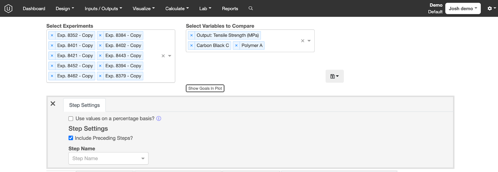
Clicking on the Select Experiments will generate a dropdown menu with your experiments to choose from––you can select as many experiments as you would like to compare.
The Select Variables to Compare dropdown menu will allow you to compare any number of properties for ingredients within those selected experiments. Users need to select at least three properties in order for the radar chart to be created.
Below these fields is a Show Goals in Plot button which allows users to show desired upper and lower limits on each specification. The save icon to the right of these fields allows users to save their visualization or load a previously-created one. For step-by-step instructions on how to save a visualization, please refer to the support guide.
Conditions and Plot Settings
Depending on which properties a user has selected, one of a few gray settings boxes will appear below the dropdown menus.
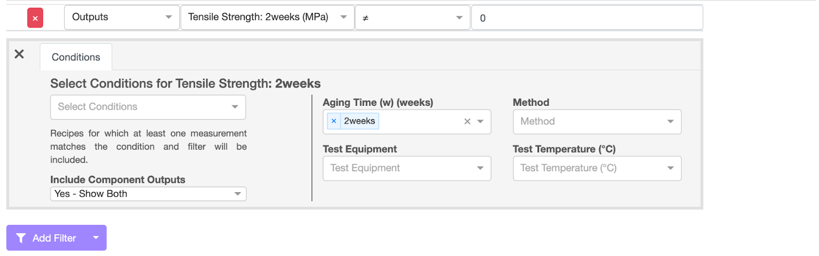
If a user has selected their outcomes as their desired properties, a new grey Conditions tab will appear in the middle of the screen. This field allows users to choose specific conditions at which the selected properties manifest, for instance, after a certain number of weeks. Additional fields allow users to choose whether to require all axes to adhere to the condition as well as whether to display components, outputs, or both on the radar chart.
On the right-hand side of the tab, users are able to set a specific Aging Time and filter the chart according to the equipment used in testing.
To the right of the Conditions tab, users can navigate to the Plot Settings tab which allows them to disregard or include outliers in their data set by checking a box. This tab will always appear, even if a user selects a mixture of ingredients, categories, and outcomes as their desired properties to visualize.
Filters
To filter the data displayed within the radar chart, simply click on the purple Add Filter button to call forth the common Uncountable filter feature.
By using a series of dropdown menus, users can select which attributes and categories to filter their data by, including inputs, outputs, projects, and even a custom category. Users then will need to specify which targets they would like to apply their selected filter to, for example to co-agents within the input category.
Additional dropdown menus allow users to use the ≠ function to exclude specific categories from the visualization or include specific values. If an experiment has multiple steps or mixes, a new grey field will appear, allowing users to select which step’s properties are to be shown in the radar chart. Further, users are able to normalize, average, or set upper/lower bounds to the data displayed in the radar chart.
Scale
Below the radar chart will lie a table enumerating the various properties displayed in the visualization as well as their numeric values, which allows users to control how their data is displayed.
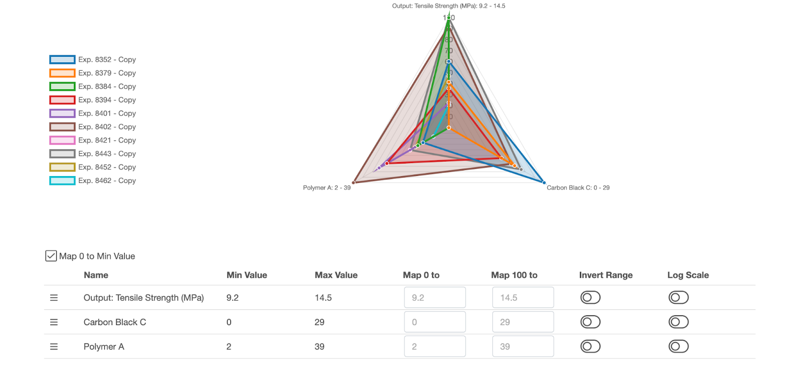
The “Map 0 to Min Value” check box allows users with negative values in their data to normalize their data, setting 0 as the lowest possible value for any given piece of data.
By clicking on the name of any given property, a user is able to rename it.
The table displays maximum and minimum values for each property with functionality to set a lower or upper mapping. For example, if a user has outliers that are distorting the chart, they could set the minimum value of any individual property to 0 and its maximum value to 100.
Additionally, the interface provides functionality to invert the scale for each (and all) of the chosen properties or to display values based on a logarithmic (rather than arithmetic) scale.