Uncountable’s Visualize Time Series function is designed to help users visually analyze time-dependent data, particularly useful in fields such as battery research where tracking electrochemical performance over time is crucial.
This feature enables users to create charts to analyze outputs such as voltage, current, and specific capacity against time or other variables.

When to Use Visualize Time Series
In battery testing, the Data Over Time chart type is frequently used to plot variables like specific capacity against time. This setup allows researchers to monitor how the performance of a battery evolves over its cycle life. Alternatively, using the X vs Y chart, you might plot voltage against specific capacity to investigate the efficiency of energy storage. If you’re working with PLC or sensor log data from process lines, this chart is also ideal for visualizing metrics like pressure or pH over time.
The Advanced Options, such as filtering by specific cycles and stages, setting axis limits, and color-coding data, allow users to further edit their visualization to discover trends or anomalies in the data. For example, filtering to view only certain stages of a charge/discharge cycle can help isolate specific points of interest.
How to Use Visualize Time Series
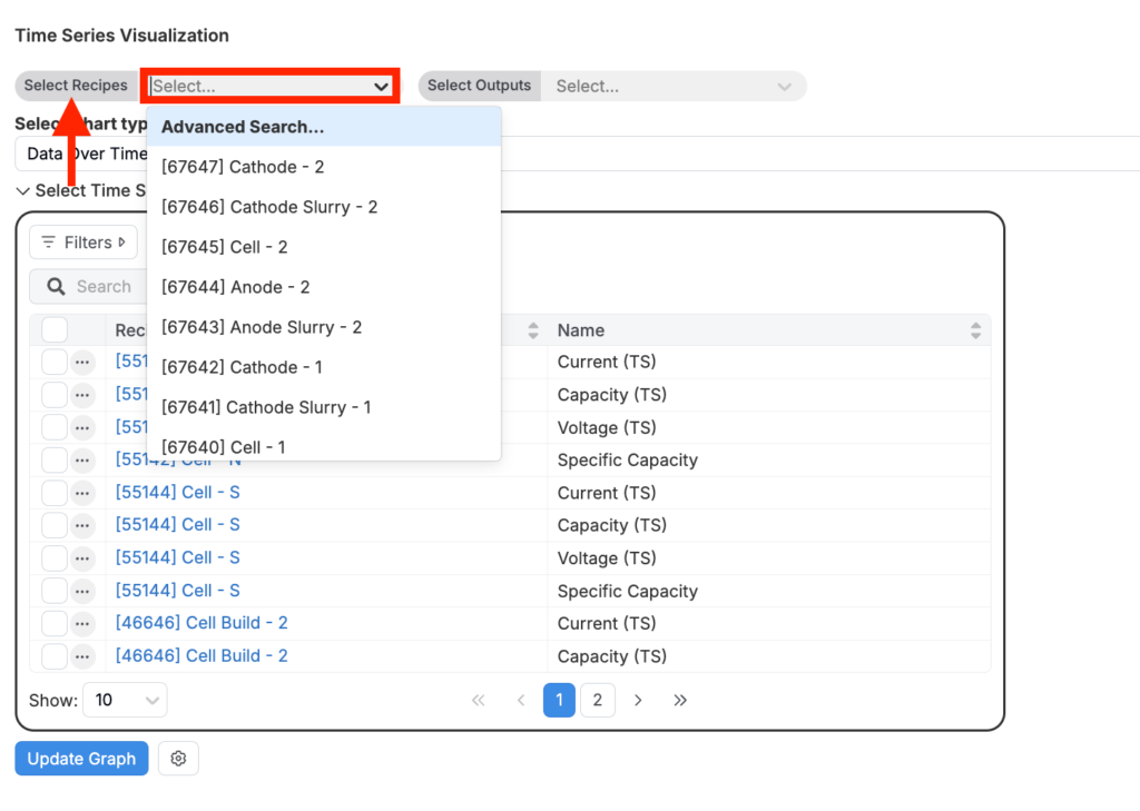
1. Selecting Your Recipes
From the Visualize Time Series page, users can choose multiple recipes to compare their performance side-by-side. Simply select the recipes from the dropdown menu or use the search function to quickly find the ones you need.
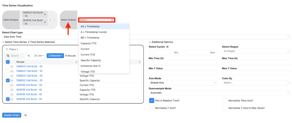
2. Choosing Your Outputs
Next, select the outputs you want to analyze. The outputs typically include variables that change over time, such as specific capacity, voltage, or current. The tool allows you to plot multiple outputs on the same graph, making it easy to compare how different outputs behave under the same conditions or across different recipes.
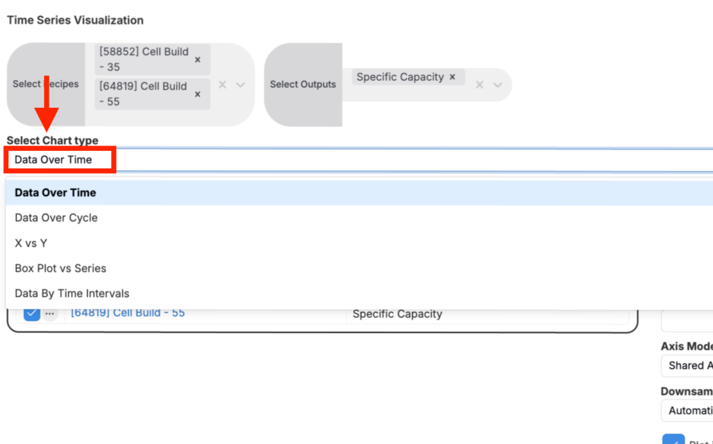
3. Picking Your Chart Type
The Visualize Time Series has several chart types to choose from:
- Data Over Time: This chart plots a variable (like voltage or specific capacity) against time.
- Data Over Cycle: Similar to “Data Over Time,” but this chart plots variables against cycle number instead of time.
- X vs Y: This chart plots one variable against another, such as voltage vs. specific capacity.
- Box Plot vs Series: This chart shows the distribution of a dataset across different series or categories, with box plots summarizing the data’s statistical characteristics (like median, quartiles, etc).
- Data by Time Intervals: This chart aggregates data within specified time intervals, allowing you to see trends or patterns at different time scales.
4. Confirming and Filtering Your Selections (Advanced Options)
Once you have selected your recipes and outputs, the tool displays them in a list where you can confirm your choices.
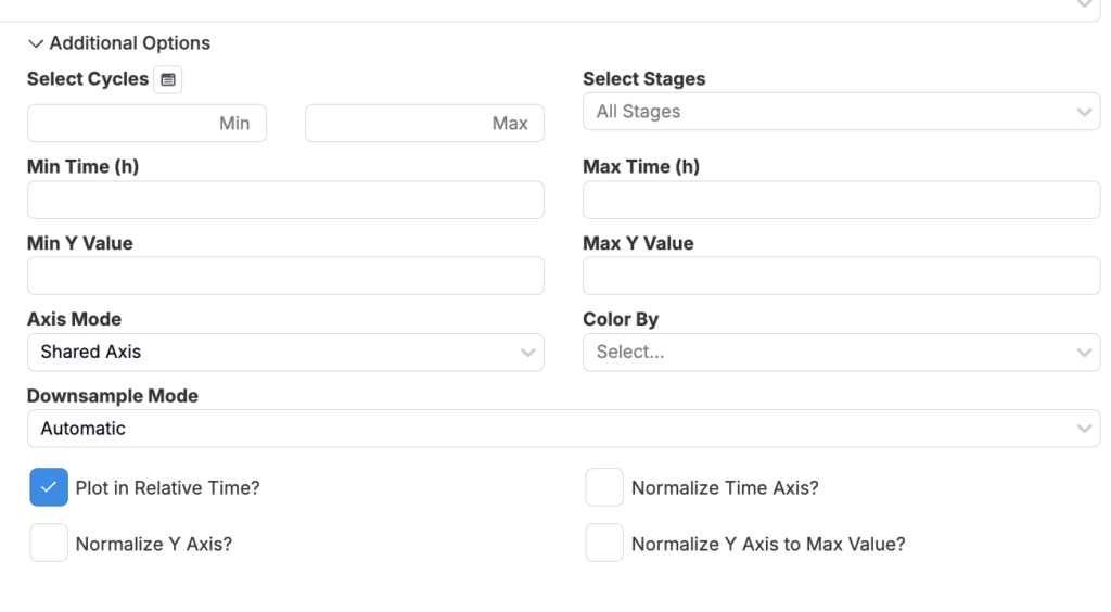
Advanced Options
Selecting recipes displays an additional “Advanced Options” window, allowing you to further customize your chart. Here, you can filter data by time, cycles, or specific stages of your experiment. Additionally, you can color-code your data by different cycles or other criteria, which can help in distinguishing between different datasets on the graph.
- Select Cycles: This option allows you to specify a range of cycles to include in your visualization. You can input minimum and maximum cycle numbers to focus on specific stages of battery life.
- Select Stages: Here, you can choose particular stages of your experiment to visualize. All stages are selected by default, but you can narrow it down to specific phases like charge, discharge, or rest stages.
- Min/Max Time (h): This option allows you to set the time range in hours. You can focus on a specific time window within the data.
- Min/Max Y Value: These fields let you set minimum and maximum Y-axis values for the chart. This can help in zooming in on a particular range of interest or in standardizing the scale across multiple charts for easy comparison.
- Axis Mode: You can choose how the axes are shared or split between different datasets.
- “Shared Axis” mode keeps the same axis scale for all datasets, which is useful for direct comparison.
- “Multiple Axis” mode allows each dataset to have its own separate axis, which is useful when comparing datasets with different scales or units.
- Color By: This option allows you to color-code the data based on different criteria, such as cycle or segment.
- Downsample Mode: Data downsampling is used to reduce the number of data points plotted, which can be useful for large datasets where plotting every single point would be impractical. The default “Automatic” mode selects the best downsampling method based on the data size.
- Plot in Relative Time?: Adjusts the X-axis to show time relative to the start of each dataset, making it easier to compare datasets that start at different times.
- Normalize Time Axis?: Scales the time axis so that different datasets can be compared on the same normalized timeline.
- Normalize Y Axis?: Scales the Y-axis for all datasets to a common scale.
- Normalize Y Axis to Max Value?: Adjusts the Y-axis of each dataset so that the maximum value is the same, which can highlight relative differences in trends.
6. Generating the Graph
To view your data visualization, click the “Show Graph” button.

Note: The system doesn’t automatically reload the data, you will need to manually refresh.